

For Part Two, click here.
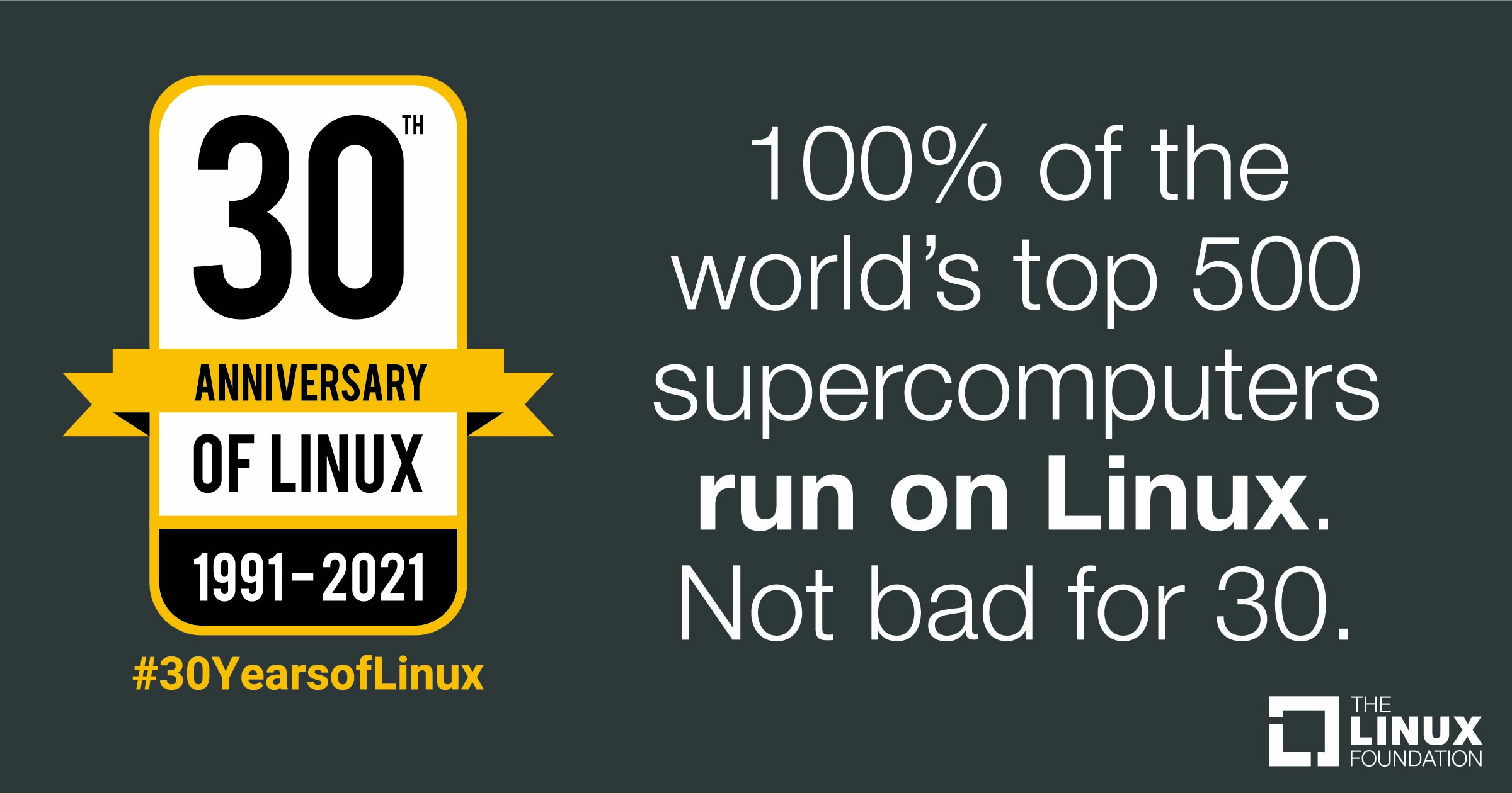
Thirty years ago, Linus Torvalds was a 21 year old student at the University of Helsinki when he first released the Linux Kernel. His announcement started, “I’m doing a (free) operating system (just a hobby, won't be big and professional…)”. Three decades later, the top 500 supercomputers are all running Linux, as are over 70% of all smartphones. Linux is clearly both big and professional.
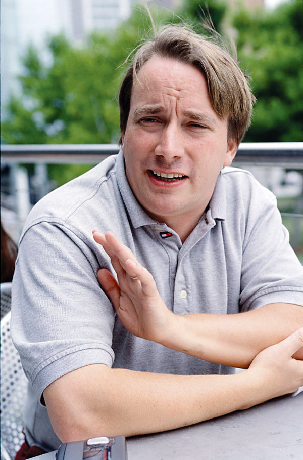
For three decades, Linus Torvalds has led Linux Kernel development, inspiring countless other developers and open source projects. In 2005, Linus also created Git to help manage the kernel development process, and it has since become the most popular version control system, trusted by countless open source and proprietary projects.
The following interview continues our series with Open Source Leaders. Linus Torvalds replied to our questions via email, reflecting on what he's learned over the years from leading a large open source project. In this first part, we focus on Linux kernel development and Git. "[Linux] was a personal project that grew not out of some big dream to create a new operating system," Linus explains, "but literally grew kind of haphazardly from me initially just trying to learn the in-and-outs of my new PC hardware."
Regarding creating Git and then handing it off to Junio Hamano to improve and maintain, Linus noted, "I don't want to claim that programming is an art, because it really is mostly just about 'good engineering'. I'm a big believer in Thomas Edison's 'one percent inspiration and ninety-nine percent perspiration' mantra: it's almost all about the little details and the everyday grunt-work. But there is that occasional 'inspiration' part, that 'good taste' thing that is about more than just solving some problem - solving it cleanly and nicely and yes, even beautifully. And Junio had that 'good taste'."
Read on for the first in a two-part interview. Check back next week for the second part, where Linus explores the lessons and insights gained from three decades at the helm of the Linux kernel.
Translations: [Chinese], [Korean], [Vietnamese]: (Contact us if you'd like to translate this interview into another language.)
Linux Kernel Development
Jeremy Andrews: Linux is everywhere, and has been an inspiration to the entire open source world. Of course, it wasn't always that way. You famously released the Linux kernel back in 1991 with a modest Usenet posting on comp.os.minix. A decade later you wrote an engaging and personal book titled, "Just for Fun: The Story of an Accidental Revolutionary" exploring much of that history. This year, in August, Linux will celebrate its 30th anniversary! That's amazing, congratulations! At what point during this journey did you realize what you'd done, that Linux was so much more than "just a hobby"?
Linus Torvalds: This may sound a bit ridiculous, but that actually happened very early. Already by late '91 (and certainly by early '92) Linux had already become much bigger than I had expected.
And yeah, considering that by that point, there were probably just a few hundred users (and even "users" may be too strong - people were tinkering with it), it probably sounds odd considering how Linux then later ended up growing much bigger. But in many ways for me personally, the big inflection point was when I realized that other people are actually using it, and interested in it, and it started to have a life of its own. People started sending patches, and the system was actually starting to do much more than I had initially really envisioned.
I think that X11 was ported to Linux some time in April '92 (don't take my word for the dates - it's a loong time ago), and that was another big step where suddenly there was a GUI and a whole new set of capabilities.
To put this all in perspective - I really didn't start out with any big plans of high expectations. It was a personal project that grew not out of some big dream to create a new operating system, but literally grew kind of haphazardly from me initially just trying to learn the in-and-outs of my new PC hardware.
So when I released the very first version, it was really more of a "look at what I did", and sure, I was hoping that others would find it interesting, but it wasn't a real serious and usable OS. It was more of a proof of concept, and just a personal project I had worked on for several months at that time.
And going from that "personal project" to being something where others used it, sent feedback (and bug reports), and occasional patches, that was the big change for me.
Just to give an example of something really fundamental: the original copyright license was something like "you can distribute this in source form, but not for money".
That was because for me one of the issues had literally been that commercial unix was expensive (well, for a poor student who spent all his money on the new PC it was), and so to me a big important thing was that the source code be available (so that people could tinker with it), and I wanted it to be open to people like me who just couldn't afford the alternatives.
And I changed the license in late '91 (or maybe very early '92) to the GPLv2 because there were people who wanted to distribute it on floppies to local Unix Users Groups, but wanted to at least recoup the costs of the floppies and their copying time. And I realized that was obviously entirely reasonable, and that the important thing wasn't the "no money", but the "source needs to be openly available" part.
End result: not only did people distribute it at Unix user group meetings, but early floppy distributions like SLS and Slackware happened within months.
Compared to those initial really fundamental changes, everything else was "incremental". Sure, some of the incrementals were pretty big (IBM coming aboard, Oracle DB being ported, Red Hat IPOs, Android becoming big on phones etc), but they were still less personally revolutionary than that early initial "people I don't even know are using Linux''.
JA: Do you ever regret your choice of license, or how much money other people and companies have made off something you created?
LT: Absolutely not.
First off, I'm doing quite well. I'm not insanely rich, but I'm a well-paid software engineer, doing what I like to do, on my own schedule. I'm not hurting.
But equally importantly, I'm 100% convinced that the license has been a big part of the success of Linux (and Git, for that matter). I think everybody involved ends up being much happier when they know that everybody has equal rights, and nobody is special with regards to licensing.
There's a fair number of these "dual license" projects where the original owner retains a commercial license ("you can use this in your proprietary product if you pay us license fees") and then on the other hand the project is also available under something like the GPL for open source cases.
And I think it's really hard to build a community around that kind of situation, because the open source side always knows it's "second class". Plus it leads to a lot of just licensing paperwork in order for the special party to always retain their special rights. So it adds a lot of friction to the project.
And on the other hand, I've seen a lot of BSD (or MIT or similar) licensed open source projects that just fragment when they become big enough to be commercially important, and the involved companies inevitably decide to turn their own parts proprietary.
So I think the GPLv2 is pretty much the perfect balance of "everybody works under the same rules", and still requires that people give back to the community ("tit-for-tat"). And everybody knows that all the other people involved are bound by the same rules, so it's all very equitable and fair.
Of course, another part of that is that you also get out what you put in. Sure, you can try to "coast" on the project and be just a user, and that's ok. But if you do that, you also have no control over the project. That can be perfectly fine too, if you really just need a basic operating system, and Linux already does everything you want. But if you have special requirements, the only way to really affect the project is to participate.
This keeps everybody honest. Including me. Anybody can fork the project and go their own way, and say "bye bye Linus, I'm taking over maintenance of my version of Linux". I'm "special" only because - and as long as - people trust me to do a good job. And that's exactly how it should be.
That "anybody can maintain their own version" worried some people about the GPLv2, but I really think it's a strength, not a weakness. Somewhat unintuitively, I think it's actually what has caused Linux to avoid fragmenting: everybody can make their own fork of the project, and that's OK. In fact, that was one of the core design principles of "Git" - every clone of the repository is its own little fork, and people (and companies) forking off their own version is how all development really gets done.
So forking isn't a problem, as long as you can then merge back the good parts. And that's where the GPLv2 comes in. The right to fork and do your own thing is important, but the other side of the coin is equally important - the right to then always join back together when a fork was shown to be successful.
Another issue is that you really want to have the tools to support that workflow, but you also have to have the mindset to support it. A big impediment to joining forks back is not just licensing, but also "bad blood". If the fork starts from very antagonistic reasons, it can be very hard to merge the two forks - not for licensing or technical reasons, but because the fork was so acrimonious. Again, I think Linux has avoided that mainly because we've always seen forking things as natural, and then it's also very natural to try to merge back when some work has shown itself to be successful.
So this answer kind of went off at a tangent, but I think it's an important one - I very much don't regret the choice of license, because I really do think the GPLv2 is a huge part of why Linux has been successful.
Money really isn't that great of a motivator. It doesn't pull people together. Having a common project, and really feeling that you really can be a full partner in that project, that motivates people, I think.
JA: These days when people release source code under the GPLv2, they generally do it because of Linux. How did you find the license, and how much time and effort did you put into reviewing other existing licenses?

LT: Back then, people still had fairly big flame wars about BSD vs GPL (I think partly fueled by how rms really has a knack for pissing people off), so I'd seen some of the license discussions just through various usenet newsgroups I was reading (things like comp.arch, comp.os.minix etc).
But the two main reasons were probably simply gcc - which was very much instrumental in getting Linux going, since I absolutely required a C compiler - and Lars Wirzenius ("Lasu"), who was the other Swedish-speaking CS student at University in my year (Swedish being a fairly small minority in Finland).
Lasu was much more into license discussions etc than I was.
To me, the choice of GPLv2 wasn't some huge political issue, it was mainly about the fact that my original license had been so ad-hoc and needed updating, and I felt indebted to gcc, and the GPLv2 matched my "you have to give source back" expectations.
So rather than make up another license (or just edit the original one - just removing the "no money can change hands" clause could have been an option), I wanted to pick one that people already knew about, and had had some lawyers involved.
JA: What is your typical day like? How much of it is spent writing code, versus reviewing code, versus reading and writing emails? And how do you balance personal life and working on the Linux Kernel?
LT: I write very little code these days, and haven't for a long time. And when I do write code, the most common situation is that there's some discussion about some particular problem, and I make changes and send them out as a patch mainly as an explanation of a suggested solution.
In other words, most of the code I write is more of a "look, how about we do it this way" where the patch is a very concrete example. It's easy to get bogged down into some theoretical high-level discussion about how to solve something, and I find that the best way to describe a solution is often to just write the snippet of code - maybe not the whole thing - and just make it very concrete that way.
Because all my real work is spent on reading and writing emails. It's mostly about communication, not coding. In fact, I consider this kind of communication with journalists and tech bloggers etc to literally be part of my workday - it may get lower priority than actual technical discussions, but I do spend a fair amount of time on things like this too.
And yes, I spend time on code reviews too, but honestly, by the time I get a pull request, generally the code in question should already have been reviewed by multiple people already. So while I still look at patches, I actually tend to look more at the explanations, and the history of how the patch came to me. And with the people I've worked the longest with, I don't do even that: they are the maintainers of their subsystem, I'm not there to micro-manage their work.
So quite often, my main job is to "be there", and be the collection point, and be the person who manages and enforces the releases. In other words, my job is generally more about the maintenance process than the low-level code.
JA: What is your work environment like? For example, do you prefer a dark room with no distractions, or a room with a view? Do you tend to work in silence, or while listening to music? What kind of hardware do you typically use? Do you review code with vi in a terminal, or with a fancy IDE? And, do you have a preferred Linux distribution for this work?
LT: My room isn't exactly "dark", but I do have the blinds on the window next to my desk closed, because I don't want bright sunlight (not that it's necessarily very common this time of year in Oregon ;). So no views, just a (messy) desk, with dual 4k monitors and a powerful desktop computer under the desk. And a couple of laptops sitting around for testing and for when I'm on the road.
And I want to work in silence. I used to hate the ticking of mechanical disk drives - happily long relegated to the garbage bin as I've used exclusively SSD's for over a decade by now - and noisy CPU fans are unacceptable too.
And it's all done in a traditional terminal, although I don't use 'vi'. I use this abomination called "micro-emacs", which has absolutely nothing to do with GNU emacs except that some of the key bindings are similar. I got used to it at the University of Helsinki when I was a wee lad, and I've not been able to wean myself from it, although I suspect I will have to soon enough. I hacked up (a very limited) utf-8 support for it a few years ago, but it's really showing its age, and showing all the signs of having been written in the 80's and the version I use was a fork that hasn't been maintained since the mid 90's.
University of Helsinki used it because it worked on DOS, VAX/VMS and Unix, which is why I got introduced to it. And now my fingers are hardcoded for it. I really need to switch over to something that is actually maintained and does utf-8 properly. Probably 'nano'. But my hacked-up piece of historical garbage works just barely well enough that I've never been really forced to teach my old fingers new tricks.
So my desktop environment is fairly simple: several text terminals open, and a web browser with email (and several other tabs, mostly news and tech sites). I want to have a fair amount of desktop space, because I'm used to having fairly big terminal windows (100x40 is kind of my default starting size), and I have multiple terminals open side-by side. Thus the dual 4k monitors.
I use Fedora on all my machines, not because it's necessarily "preferred", but because it's what I'm used to. I don't care deeply about the distribution - to me it's mainly a way to get Linux installed on a machine and get all my tools set up, so that I can then replace the kernel and work on just that.
JA: The Linux Kernel Mailing List is where kernel development happens publicly, and is extremely high traffic. How do you keep up with so much email? Have you explored other solutions for collaboration and communication outside of a mailing list, or is there something about a simple mailing list that is perfect for what you do?
LT: Oh, I don't read the kernel mailing list directly, and haven't in years. It's much too much.
No, the point of the kernel mailing list is that it basically gets cc'd on all the discussions (well - one of the kernel mailing lists do, there are many - and then the traditional lkml list is the fallback for when there isn't some more targeted list). And that way, when a new person is brought into the discussion, they can see the history and the background by looking at the kernel mailing list.
So what I used to do was to be subscribed to the list, but have all the lkml email that I wasn't cc'd on personally be auto-archived, so I'd not see it by default. But then when some issue escalated to me, all that discussion would show up, because it was there in my email, just not in my inbox until it was needed.
These days, I actually use the lore.kernel.org functionality instead, because it works so well and we have some other tools built around it. So rather than having it auto-archived in my own mail archives, the discussions end up being visible that way instead. But the basic workflow is conceptually the same.
I do get a fair amount of email still, obviously - but in many ways it has been getting better over the years, rather than worse. A big part of that is Git and how well the kernel release flow works: we used to have many more problems with code flow, and tooling. My email situation was actually much much worse back around the turn of the century, when we still dealt in huge patch-bombs and we had serious scalability problems in the development flow.
And the mailing list (with tooling around it) model really does work very well. That's not to say that people don't use other means of communication in addition to email (both person-to-person, and the mailing lists): there are people who enjoy various realtime chat setups (IRC being the traditional one). And while that has never been my thing, it is clearly what some people like to use for brainstorming. But that "mailing list as an archive" model works very well, and works seamlessly together with the whole "send patches between developers as emails" and "send problem reports as emails".
So email remains the main communication channel, and makes it easy to discuss technical issues, with patches embedded in the same medium. And it works across time zones, which is very important when everybody is so spread out geographically.
JA: I followed kernel development closely for about a decade, blogging about it on KernelTrap and writing about new features as they evolved. I stopped around the time the 3.0 kernel was released, which had followed 8 years of 2.6.x versions. Is it possible to summarize some of the more interesting things that have happened in the kernel since the 3.0 release?
LT: Heh. That's so long ago that I couldn't even begin to summarize things. It's been a decade since 3.0, and we've had a lot of technical changes in that decade. ARM has grown up and ARM64 has become one of our primary architectures. Lots and lots of new drivers, and new core functionality.
If anything, what is interesting about the last decade is how we've actually kept the actual development model really smooth, and what hasn't changed.
We've gone through many different version number schemes over the decades, we've had different development models, but the 3.0 release was in fact the one that finalized the model we've used ever since. It kind of made official the whole "releases are time-based, version numbers are just numbers, and don't have any feature dependencies".
We'd started the whole time-based releases with a merge window in the 2.6.x days, so that part wasn't new. But 3.0 was when the last vestiges of "the number has meaning" were thrown overboard.
We'd had the random numbering scheme (mainly before 1.0), we'd had the whole "odd minor numbers means development kernel, even means stable production kernel" model, and then in 2.6.x we started doing the time-based release model. But people still had that "what will it take to increase the major number" question. And 3.0 made it official that even the major version number has no meaning, and that we'll just try to keep the numbers easy to deal with and not let them grow too big.
So for the last decade, we've made absolutely huge changes (Git makes it easy to show some statistics in numbers: about three quarters of a million commits by over 17 thousand people). But the development model itself has actually been quite smooth and stable.
And that really hasn't always been the case. The first two decades of kernel development were full of fairly painful development model changes. This last decade has been much more predictable release-wise.
JA: As of now, the latest release is 5.12-rc5. How standardized is the release process? For example, what sorts of changes go into an -rc1, versus an -rc2 and so on? And at what point do you decide a given release is ready to be officially released? What happens if you're wrong and a large regression is found after the final release, and how often does this happen? How has this process evolved over the years?
LT: So I alluded to this earlier: the process itself really is pretty standard, and has stayed so for the last decade. It went through several upheavals before that, but it's actually been almost like clock-work since 3.0 (and in fact a few years before that - the switch to Git in many ways was the beginning of the modern process, and it took a while before everybody got used to it).
So we've had this cadence of "two weeks of merge window" followed by roughly 6-8 weekly release candidates before final release for almost 15 years by now, I think.
And the rules have always been the same, although they haven't always been entirely strictly enforced: the merge window is for new code that is supposedly "tested and ready", and then the subsequent roughly two months are for fixes and to actually make sure all the problems are shaken out. Which doesn't always happen, and sometimes that supposedly "ready" code gets disabled or outright reverted before the release.
And then it repeats - so we have a release roughly every 10 weeks or so.
And the release criteria is me feeling confident enough, which obviously in turn is based on what kinds of problem reports are still coming in. If some area still shows issues late in the rc game, I'm fairly aggressive about just reverting things, and saying "we'll deal with this in a later release once we've figured the thing out fully", but on the whole it's fairly rare that that is needed.
Does it always work out? No. Once the kernel is released - and particularly once a distro picks it up - you get new users, you get people who didn't test it during development that find things that didn't work and we didn't catch during the rc series. That's pretty much inevitable. It's part of why we have the whole "stable kernel" trees, which continue to add fixes after the release. And some stable kernels are maintained for longer than others, and get called LTS ("Long Term Support") kernels.
All of this has remained fairly unchanged in the last ten years, although we do end up having a lot more automation in place. Kernel testing automation is hard in general - partly because so much of the kernel is drivers which then obviously depends on hardware availability - but there are several farms doing both boot and performance testing, and do various randomized load testing. And that has improved a lot over the years.
JA: Last November you were quoted as being impressed by Apple's new ARM64 chips found in some of their new computers. Are you following the development effort to support them with Linux? I see work was merged into for-next. Is it likely Linux will boot on Apple's MacBook hardware as early as the upcoming 5.13 kernel? Are you likely to be an early adopter? What is the significance of ARM64?
LT: I'm checking in on it very occasionally, but it's early days yet. As you note, the very early support will likely be merged into 5.13, but you need to realize that that is really only the beginning, and doesn't make Apple hardware useful with Linux yet.
It's not the arm64 part that ends up being the problem, but all the drivers for the hardware around it (the SSD and GPU in particular). The early work so far gets some of the really low-level stuff working, but doesn't result in anything useful outside of early hardware enablement. It will take some time for it to be a real option for people to try out.
But it's not just the Apple hardware that has improved - the infrastructure for arm64 in general has grown up a lot, and the cores have gone from "Meh" to being much more competitive in the server space. The arm64 server space was pretty sad not that long ago, but Amazon's Graviton2 and Ampere's Altra processors - both based on the much improved ARM Neoverse IP - are much better than what the offerings were a few years ago.
I've been waiting to have a usable ARM machine for over a decade by now, and it's not there yet, but it's clearly much closer than it used to be.
In fact, I guess I could say that I've been wanting an ARM machine for much longer than that - back when I was a teenager, the machine I really wanted was an Acorn Archimedes, but availability and price made me go with a Sinclair QL (M68008 processor) and then obviously a few years later a i386 PC instead.
So it's been kind of brewing for decades, but they still haven't been widely available and price/performance competitive as computers for me. One day. Hopefully in the not too distant future.
JA: Is there anything in the kernel which is not optimal, but would require a complete rewrite to address properly? In other words, the kernel is 30 years old and knowledge, languages and hardware have changed a lot in these 30 years: if you rewrote it from scratch now, what would you change?
LT: We've actually been really good about even completely rewriting things if necessary, so anything that would have been an unmitigated disaster has long since been rewritten.
Sure, we have a fair amount of "compatibility" layers, but they are usually not horrendous. And it's unclear if even those compatibility layers would really go away if rewriting from scratch - they are about backwards compatibility with older binaries (and often backwards compatibility with older architectures, e.g. running 32-bit x86 apps on x86-64). Since I consider backwards compatibility to be very important, I'd want to keep those even in a rewrite.
So there are obviously lots of things that are "not optimal" in the sense that anything can be improved, but the way you phrase the question, I'd have to say that no, there's nothing there that I despise. There's legacy drivers that nobody is ever going to care about enough to clean up, and so they may do ugly things, but a key part of that is "nobody cares enough". It hasn't been a problem, and when it does become a problem we tend to fairly actively remove true legacy support that we can't find anybody that cares about. So we've gotten rid of lots of drivers over the years, and we've gotten rid of whole architecture support when it no longer makes any sense at all to maintain.
No, the only major reason for a "rewrite" would be if you end up having some use-case where the whole structure no longer makes sense. The most likely scenario would be some small embedded system that just doesn't want everything that Linux offers, and has a hardware footprint so small that it simply wants something smaller and simpler than what Linux has become over the years.
Because Linux has grown a lot. Even small hardware (think cell phones etc) today is much more capable than the original machine Linux was developed on was.
JA: What about rewriting at least parts with Rust, a language that was specifically designed for performance and safety? Is there room for improvement in this way? Do you feel it’s ever possible for another language like Rust to replace C in the kernel?

LT: We'll see. I don't think Rust will take over the core kernel, but doing individual drivers (and maybe whole driver subsystems) in it doesn't sound entirely unlikely. Maybe filesystems too. So it's not "replace C", but more of "augment our C code where it makes sense".
Of course, drivers in particular is about half of the actual kernel code, so there's a lot of room for that, but I don't think anybody is really expecting to rewrite existing drivers in Rust wholesale, more of a "some people will do new drivers in Rust, and a couple of drivers might be rewritten where it makes sense".
But right now that's more of a "people are trying it out and playing with it" rather than anything more than that. It's easy to point to advantages, but there are certainly complexities too, so I'm very much taking a wait-and-see approach to see if the promised advantages really do pan out.
JA: Are there any specific parts of the kernel that you are personally most proud of?
LT: The stand-out parts I tend to point to are the VFS ("virtual filesystem") layer (and the pathname lookup in particular) and our VM code. The former because Linux just does some of those fundamental things (looking up a filename really is such a core operation in an operating system) so much better than anything else out there. And the latter mainly because we support 20+ architectures, and we still do it with a largely unified VM layer, which I think is pretty impressive.
But at the same time, this is very much a function of "what part of the kernel do you care about". The kernel is big enough that different developers (and different users) will simply have different opinions of what matters most. Some people think scheduling is the most exciting part of the kernel. Others like the nitty-gritty of device drivers (and we have a lot of those). I personally tend to be more involved in the VM and VFS areas, so I then naturally point to those.
JA: I found this description of pathname lookup, and it's more complex than I expected. What makes the Linux implementation so much better than what is done in other operating systems? And what do you mean by "better"?
LT: Pathname lookup is really such a common and fundamental thing that most people outside of kernel developers don't even think about it as a problem: they just open files, and take it all for granted.
But it's actually fairly complicated to do really well. Exactly because absolutely everything does pathname lookups all the time, it's hugely performance-critical, and it's very much one of those areas where you also want to scale well in SMP environments, and it has lots of complexity in locking. And you very much do not want to do any IO, so caching is very important. In fact, pathname lookup is so important that you can't leave it to the low-level filesystem, because we have 20+ different filesystems, and having each of them do their own caching and their own locking would be a complete disaster.
So one of the main things the VFS layer does is really handle all the locking and caching of pathname components, and handle all the serialization and the mount point traversal, and do it all with mostly lock-free algorithms (RCU), but also with some really clever lock-like things (the Linux kernel "lockref" lock is a very special "spinlock with reference count" which was literally designed for the dcache caching, and it's basically a specialized lock-aware reference count that can do lock elision for certain common situations).
End result: the low-level file systems still need to do the actual lookup for things that aren't cached, but they don't need to worry about caching and all the coherency rules and the atomicity rules that go along with pathname lookups. The VFS handles all that for them.
And it all outperforms anything any other operating system has done, while basically scaling perfectly to even machines with thousands of CPU's. And it does that even when those machines all end up touching the same directories (because things like the root directory, or a project home directory, are things that even heavily threaded applications all touch at the same time, and that don't get distributed to any kind of per-thread behavior).
So it's not just "better", it's "Better" with a capital 'B'. Nothing else out there comes even close. The Linux dcache is simply in a class all its own.
JA: The past year has been difficult all around the world. How has the COVID-19 pandemic affected the kernel development process?
LT: It actually has had very minimal effect, because of how we always worked. Email really ends up being a wonderful tool, and we didn't rely on face-to-face meetings.
Yes, it did affect the yearly kernel summit last year (and this year is still up in the air), and most conferences got cancelled or turned virtual. And people who worked in offices before mostly started working from home (but a lot of the core kernel maintainers already did so). So a lot of things around it changed, but the core development itself worked exactly as before.
And it obviously affected all our lives in other ways - just the social ramifications in general. But on the whole, being a kernel developer who already interacted with people almost entirely over email, we were probably some of the least affected.
Git Distributed Version Control System
JA: Linux is only one of your ubiquitous contributions to open source. In 2005 you also created Git, the extremely popular distributed source control system. You quickly migrated the Linux kernel source tree out of the proprietary Bitkeeper and into the newly created and open sourced Git, and in the same year handed off maintainership to Junio Hamano. There's a lot of fascinating history there, what led you to handing off leadership on this project so quickly, and how did you find and select Junio?
LT: So there's two parts to this answer.
The first part is that I very much did not want to create a new source control system. Linux was created because I find the low-level interface between hardware and software fascinating - it's basically a labor of love and personal interest. In contrast, Git was created out of necessity: not because I found source control interesting, but because I absolutely despised most source control systems out there, and the one that I found most palatable and had really worked fairly well in the Linux development model (BitKeeper) had become untenable.
End result: I've been doing Linux over 30 years (the anniversary of the first release is still a few months away, but I had started on what would become Linux already 30 years ago), and I've been maintaining it the whole time. But Git? I did not ever think I'd really want to maintain it long-term. I love using it, and I obviously think it's the best SCM out there by a huge amount, but it's not my fundamental passion and interest, if you see what I'm trying to say.
So I always wanted somebody else to maintain the SCM for me - in fact I would have been happiest had I not had to write one in the first place.
That's kind of the background.
As to Junio - he was actually one of the very first people who came in as Git developers. His first change came in within days after I had made the very first (and very rough) version of Git public. So Junio has actually been around some since pretty much the beginning of Git.
But it's not like I handed the project off to the first random person to show up. I did maintain Git for a few months, and the thing that made me ask Junio if he wanted to be the maintainer is that very-hard-to-describe notion of "good taste". I don't really have a better description for it: programming is about solving technical problems, but how you solve them, and how you think about them is important too, and it's one of those things you start to recognize over time: certain people have that "good taste" thing and pick the "right" solution.
I don't want to claim that programming is an art, because it really is mostly just about "good engineering". I'm a big believer in Thomas Edison's "one percent inspiration and ninety-nine percent perspiration" mantra: it's almost all about the little details and the everyday grunt-work. But there is that occasional "inspiration" part, that "good taste" thing that is about more than just solving some problem - solving it cleanly and nicely and yes, even beautifully.
And Junio had that "good taste".
And every time Git comes up, I try to remember to really make it very very clear: I may have started and designed the core ideas in Git, but I often get too much credit for that part. It's been 15+ years, and I was really only involved with Git in that first year. Junio has been an exemplary maintainer, and he's the one who has made Git what it is today.
Btw, this whole "good taste" thing and finding people who have it, and trusting them - that's very much not just about Git. It's very much the history of Linux too. Unlike Git, Linux is obviously a project that I still do actively maintain, but very much like Git, it's also a project with lots of other people involved, and I think one of the big successes of Linux is having literally hundreds of maintainers around, all with that hard-to-define "good taste", and all people who maintain parts of the kernel.
JA: Have you ever given control to a maintainer only to later determine it was the wrong decision?
LT: Our maintainership structure has never been so black-and-white and inflexible that that would ever have been an issue. In fact, it's not like we even make maintainership control be something very documented: we do have a MAINTAINERS file, but that's so that you can find the right people, it's not really a sign of some exclusive ownership.
So the whole "who owns what" is more of a fluid guideline, and a "this person is active and is doing a good job" than some "oops, now we gave that person ownership and then he screwed up".
And it's fluid also in the sense that maybe you are the maintainer of one subsystem, but if there's something you then need from another subsystem, you can often cross borders. Usually it's something that people talk about extensively before doing, of course, but the point is that it does happen and it's not some hard "you're only supposed to touch that file" kind of rule.
In fact, this is actually somewhat related to the earlier discussion about the licensing, and another example of how one of the design principles of "Git" was that whole "everybody has their own tree, and no tree is technically special".
Because a lot of other projects have used tooling - like CVS or SVN - that fundamentally does make some people special, and that fundamentally does have a "ownership" that goes along with it. In the BSD world, they call it the "commit bit": giving a maintainer the "commit bit" means that he's now allowed to commit to the central repository (or at least parts of it).
I always detested that model, because it inevitably results in politics and the "clique" model of development, where some people are special and implicitly trusted. And the problem isn't even the "implicitly trusted" part - it's really that the other side of the coin is that other people are not trusted, and are by definition outsiders, and have to go through one of the guardians.
Again, in Git that kind of situation doesn't exist. Everybody is equal. Anybody can do a clone, do their own development, and if they do a good job they can get merged back (and if they do an outstanding job, they become maintainers, and they end up being the ones doing the merging into their trees ;).
So there's no need to give people special privileges - no need for that "commit bit". And that also means that you avoid the politics around it, and you don't need to trust people implicitly. If they end up doing a bad job - or more commonly, just end up fading away and finding another interest - they don't get merged back, and they also don't stand in the way of other people who have fresh new ideas.
JA: Do new features of Git ever impress you, and become part of your workflow? Are there features you'd still like to see added?
LT: My use cases were obviously the first ones to be fulfilled, so for me it has seldom been about new features.
Over the years, Git has certainly improved, and some of it has been noticeable in my workflow too. For example, Git has always been fairly fast - it was one of my design goals, after all - but a lot of it was originally done as shell-script around some core helper programs. Over the years, most of that shell scripting has gone away, and it means that I can apply patch-bombs from Andrew Morton even faster than I could originally. Which is very gratifying, as that was actually one of the early benchmarks I used for performance testing.
So Git has always been good for me, but it's gotten better.
The big improvements have been about how much better it has become to use as a "regular user". A lot of that has been people learning the Git workflow and just getting used to it (it is very different from CVS and other things that people used to be used to), but a lot of it is Git itself having become a lot more pleasant to use.
Conclusion, Part One
In the second part of this interview, Linus talks about what he's learned from managing a large open source project. He offers much insight and advice to maintainers about what he's found works best for him, and how he avoids burn out. He also talks about the Linux Foundation, and what he does when he's not focused on developing the Linux kernel.
For Part Two, click here
Click the link to see what other Open Source Leaders talk with Tag1 about.